
✺ 01 / nike
Simplifying Chat Support
App, Web

Challenge
Nike's chat support operates on two distinct platforms.
This results in:
Feature disparity due to separate tech stacks.
Longer onboarding due to complex systems.
Increased operational costs with two vendors.

opportunity
Transition to a unified platform.
This results in:
Streamlined chat interface for ease of use.
Improved communication between consumers and support teams.
Simplified maintenance and accelerated feature deployment across platforms.

role
Lead UX Discovery & Research
Lead UX / UI Design
Lead Design Integration & QA
Timeline
FY23–FY24
Process
Discovery & Research
Design & Prototyping
Agile Design & Dev Integration
Roadmap Refinement
Tools
Figma / Figjam
Miro
UserTesting.com
Google Forms
Jira
The Digital Product & Design team led the project working hand-in-hand with global tech partners and third-party vendors to guide us.
We embraced iterative cycles in discovery, design, development, and deployment across both app and web.

Process
Principles
This project is grounded in a unique set of principles to help steer our design approach. These principles ensured that we consistently addressed user needs while balancing functional performance and technical requirements.
Flow
Our design process involved iterative cycles of Analysis, Research, Synthesis, and Prototyping. This allowed us to adapt our focus based on the specific needs of the project and team ensuring that design resources were used as efficiently and effectively as possible.
Exploration
Our design process was adaptable, embracing repeated cycles of ideation, prototyping, testing, and refinement. This helped us create a digital product that was more intuitive, technically sound, and scalable.
Communication
We communicated our ideas and their implications early and often, significantly influencing the project's direction. This clear and consistent communication ensured that all internal teams and external stakeholders were aligned and informed, fostering transparency and unity from the outset.
discovery
/ data
We gathered and organized essential data to better understand the specific challenges and opportunities within the space.
Gap Analysis
Technical Reviews
Research Deep-Dive
discovery & design
/ INsights
We dove into the project’s nature and examined possible solutions, focusing on usability and feasibility.
Design Sprints
User Surveys & Testing
Key Problems to Solve
Design
/ Ideation
Our ideas are continuously refined and evolved, drawing from user feedback and technical evaluations to enhance their effectiveness.
Concept Designs
Benchmarking
MVP Designs
dev & deployment
/ validation
This phase helped ensure our solutions were vetted and reliable, ready to perform effectively in real-world scenarios.
Sprint Refinement
User Acceptance Testing
UXQA
Discovery / data
During Discovery, we focused on understanding the current landscape and identifying areas for improvement. Research Deep-Dives, Gap Analysis, and Technical Reviews with the Salesforce Product Team helped us map out key features and journeys to identify supported functionality.
We're a bit restricted when it comes to how the web interface will look, but the improvement users will see will still be substantial.
previous web interface

Previous Web Interface / Purpose

Previous Web Interface / Queue

Previous Web Interface / Messages

Previous Web Interface / Media
We have more wiggle room with the app, which allows us more flexibility in our design approach—and we’re not starting from scratch.
Previous app interface

Previous App Interface / Loading

Previous App Interface / Purpose

Previous App Interface / Messages

Previous App Interface / Media
Discovery & design / insights
During this phase, we concentrated on getting a deeper understanding of user needs and behaviors. Through Design Sprints, User Surveys & Testing, and identifying Key Problems to Solve, we uncovered crucial insights. These insights enabled us to pinpoint key challenges and opportunities, guiding our design decisions and ensuring that our solutions were aligned with user expectations.

Discovery / Key Problems to Solve - Problem #1

Discovery / User Survey
We used a mix of testing methods to help us identify how to improve how users find and enter chat.
During our design sprint, we used UserTesting.com to help us understand consumer expectations for finding and re-engaging with chat as an asynchronous support channel. When access to these resources became limited, we adapted by developing our own user survey through Google Forms. This allowed us to dive deeper and fine-tune our approach, ensuring that the next evolution of chat entry and re-entry were more accessible and intuitive, meeting users exactly where they needed support.

Discovery / Design Sprint

Discovery / Design Sprint
What we wanted to know….
Role of the FAB
Understand how consumers would expect to re-engage into chat after they’ve initiated a chat conversation via the Message Us CTA during crucial moments in their pre-purchase and post purchase experiences.
Effective Message Alerts
Gain a better understanding of how consumers expect to see new message notifications and if the notifications presented allow locating a message response quickly.
Capturing Re-Entry User Sentiments
Observe consumer attitudes towards the FAB as either a helpful or distracting feature. Learn preferences around styles and color that is most noticeable and clear to them.
Minimize vs Close Chat
Understand if consumers understood how to minimize the chat window and if they understood how to exit out of the chat completely. Additionally, what they expected to see or not see with regard to chat after concluding their conversation.
What we uncovered…
Insight 1
High Satisfaction with FAB
Users unanimously approved of the Floating Action Button (FAB), indicating its effective functionality in accessing the chat.
Insight 2
Light Interface Preferred
Despite initial visibility challenges, the majority of users (3 out of 5) preferred the light version of the interface.
Insight 3
Numbered Notifications Favored
All users (5 out of 5) favored numbered indicators for notifications, demonstrating a preference for clear, quantitative communication of new messages.
Insight 4
Color Use Confusion
A notable portion of users (2 out of 5) showed confusion regarding the color cues used for chat entry and re-entry points.
Insight 5
Message Preview Notifications Preferred
Most users (3 out of 5) preferred to receive message previews as notifications, highlighting their appeal for keeping informed.
Insight 6
Navigation Clarity Achieved
Users universally understood the process to leave and return to chat, indicating that navigation within the chat function is user-friendly.
Insight 7
Desire for Persistent FAB
Some users (2 out of 5) expressed a preference for the FAB to remain visible post-chat, suggesting it facilitates easier re-engagement.
Insight 8
Re-entry More Effective Than Entry
Users were more satisfied with re-entry (4.5 out of 5) than with chat entry (3.5 out of 5), indicating a need to improve chat entry.
Design / Ideation
During the this phase, we dedicated our efforts to creatively addressing user needs and technical possibilities for the core experience with a focus on reducing friction around our two other key problems.
Key problem #2:
"How might we make chat easy for consumers to get support?"

Discovery / Key Problems to Solve - Problem #2
Key Problem #3:
"How might we make chat easy for consumers to buy products?”

Discovery / Key Problems to Solve - Problem #3
We look for ways to maximize the impact of design by continuously refining the core experience of chat through design iteration.
Here, we begin experimenting with benchmarking against industry standards, varying design concepts, and prototyping to ensure our chat product is competitive, stands out for its quality and practicality, and allows us to continually uncover and refine our user requirements.
Benchmarks

Benchmark - Airbnb

Benchmark - Gymshark

Benchmark - Walmart
Benchmark - Amazon
Who says we can’t have fun in the process? We look for ways to delight our users as well as our stakeholders.
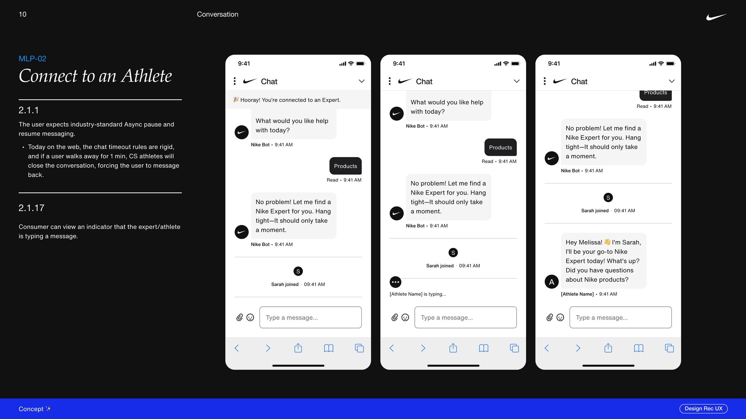
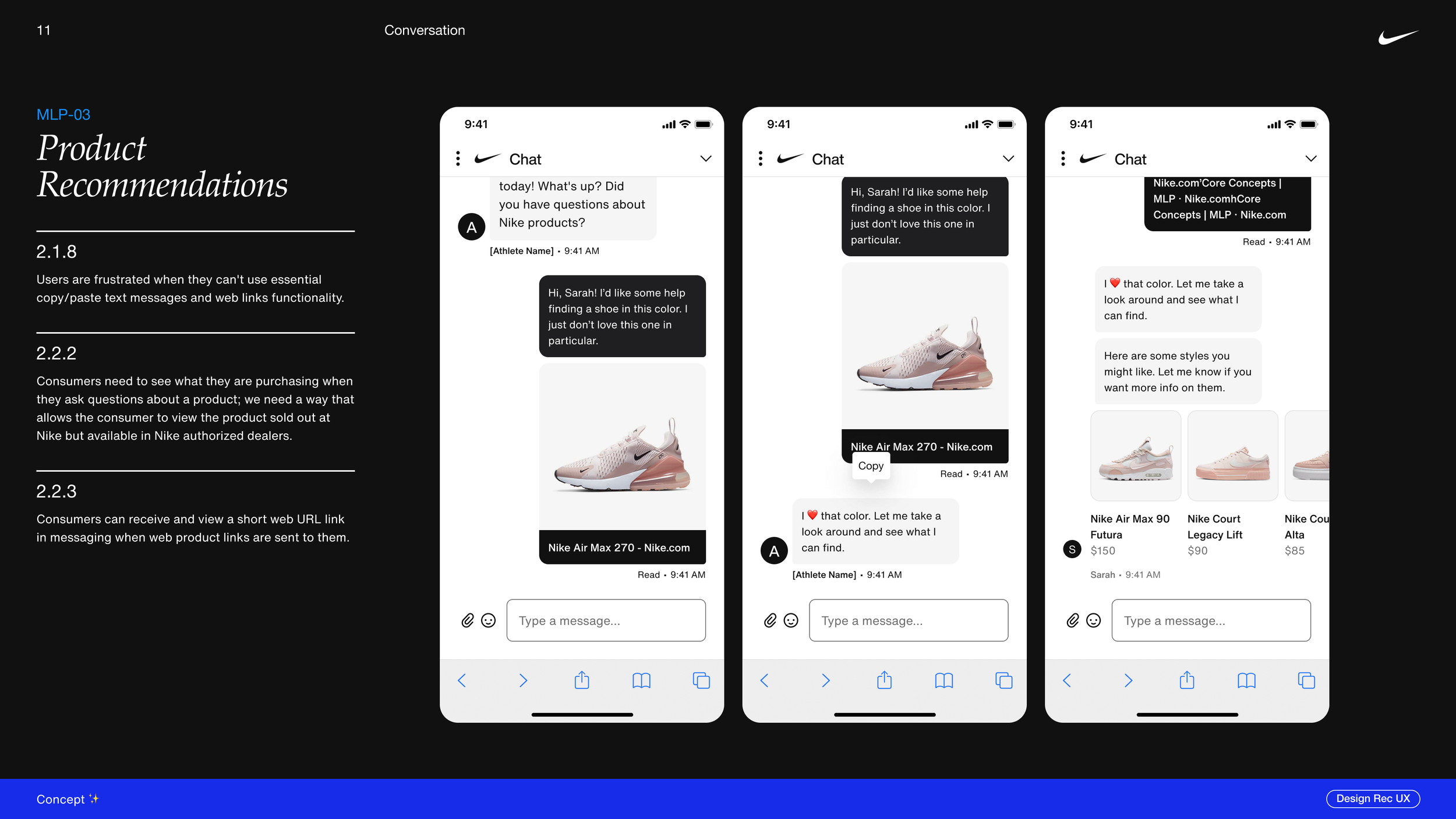
Concept Designs
Here, we focused on showcasing Minimal Lovable Products (MLP) that delivered essential functionality alongside features that users would love. Our concept designs balanced core requirements with a light-hearted storytelling element to uplift the product as well as engage our audience.
This helped influence buy-in for essential user flows and opened opportunities to address our key problems while delighting our users (while not taking ourselves too seriously). These ideas would lay the groundwork for future iterations, identifying critical areas for enhancement during the MVP phase.


mvp designs

We had to adapt our design process several times to overcome staffing changes with our Product teams.
Nailing down user requirements proved challenging due to unforeseen changes in staffing within the product team, which disrupted our usual flow of information and collaboration. In response to these shifts, the design team played a crucial role in bridging the gap.
By relentlessly pursuing renewed relationships and re-establishing lines of communication, we were able to maintain continuity and momentum in the project. This proactivity not only kept the project on track but also highlighted the value of a responsive and adaptable design process in overcoming internal hurdles and ensuring that user needs continued to drive our development efforts.
05. visual design
After several rounds of user testing on the interactive prototype, we identified many elements could use improvement. Users found it more difficult to find the information they were looking for. We determined the data was better formatted in a list view instead of tile cards. We also found that utilizing Intel®’s brand colors from their Brand Identity Guidelines to communicate the health or status of a product made other brand elements confusing. Following these sessions, we made adjustments to key concepts affected by the feedback we received.

Key Takeaways
Get feedback early & often. 👂
During the abbreviated timeline, our team found success in leaning heavily on collaboration and simplicity. We often integrated with the client and other available resources during whiteboard sessions. Because of this open style on iteration, we were able to make strides to improve upon the overall experience of not only the project, but the product as well.
You don’t know what you don’t know, ya know? 😅
Access to our technical resources for the project were limited, which made aspects of the project more challenging, especially in dealing with limitations and expectations of our teams and the project stakeholders. Often, the team was striving for the best experience, but without a strong sense of technical feasibility. We offset this by establishing a rigid schedule of meetings with technical resources and stakeholders.